New Email Design
Our previous emails were a little bit plain! While this wasn’t a major problem in itself, the bigger issue related to recipients performing the requested actions contained in these emails. Due to the sheer volume of emails that people receive, users frequently would scan quickly over emails and were likely to miss text describing their next steps.
We went back to the drawing board and restyled all of our emails.
Improved Style and More Obvious Actions
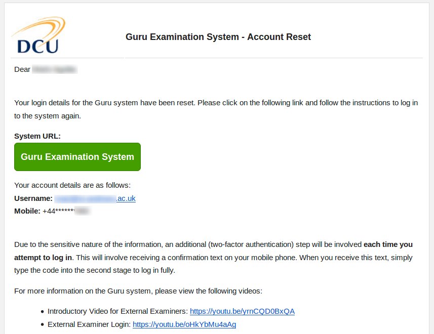
With the new style, the emails look more professional and are easier to read. More importantly, where an action is requested, these now appear as a large green button, such as in the screenshot below.

As before, Superusers can access the email audit log and view all emails that have been sent out by Guru (in the new style).
